︎Projects
Here are some of my most recent projects that I completed either independently or through my BFA study. These selected pieces are my graphic design work only. To see other artworks, please visit the “Other” tab.
01: “Hello, World!”
2023
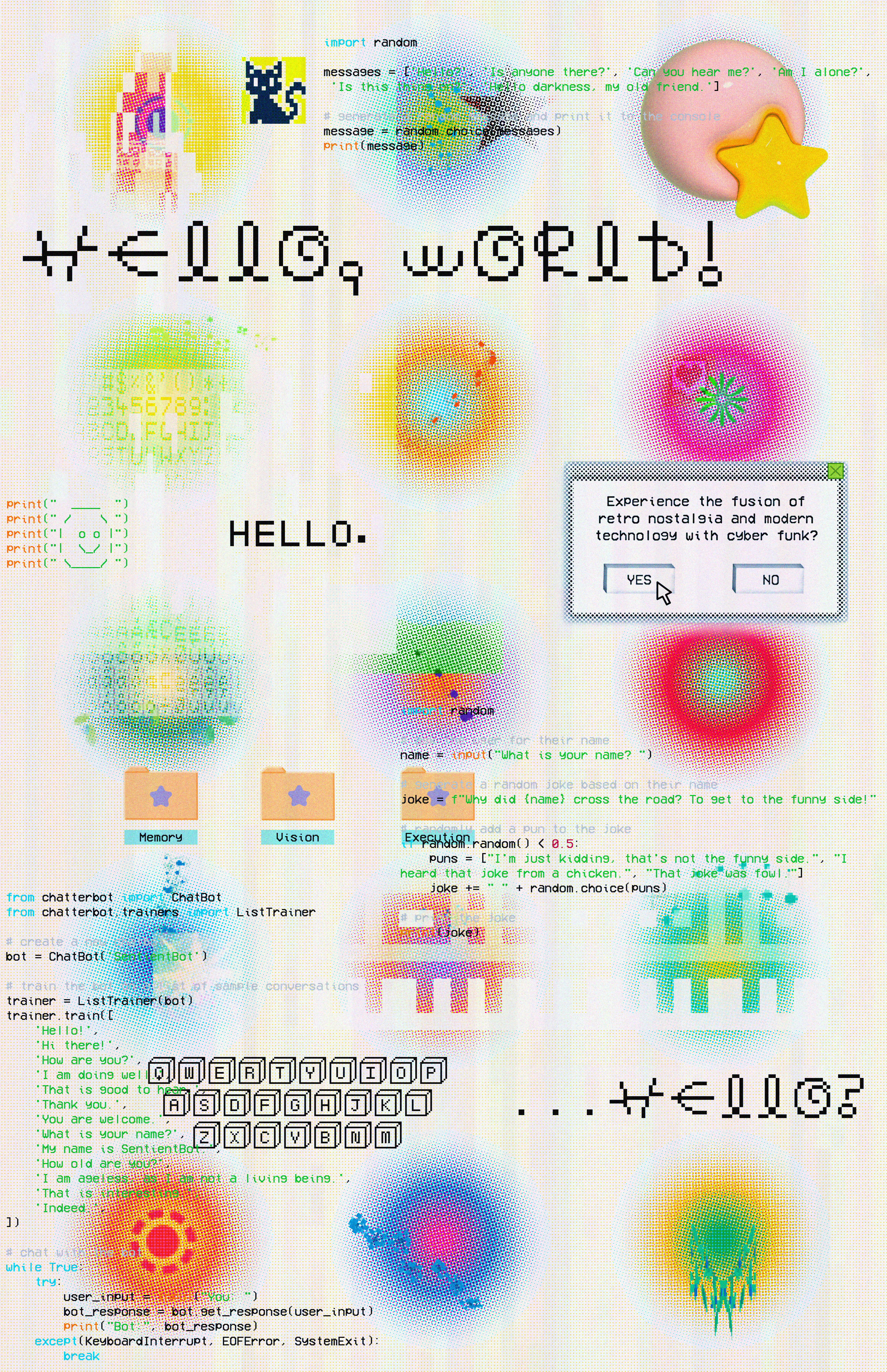
Made in 2023, this piece explores the “fusion of retro nostalgia and modern technology with cyber funk”. This free-flowing jumble of pixels, pngs, text, lines of code, and gradient color combinations is what I see in my mind when I picture technology in its past, present, and future.
02: “starlight”
2023
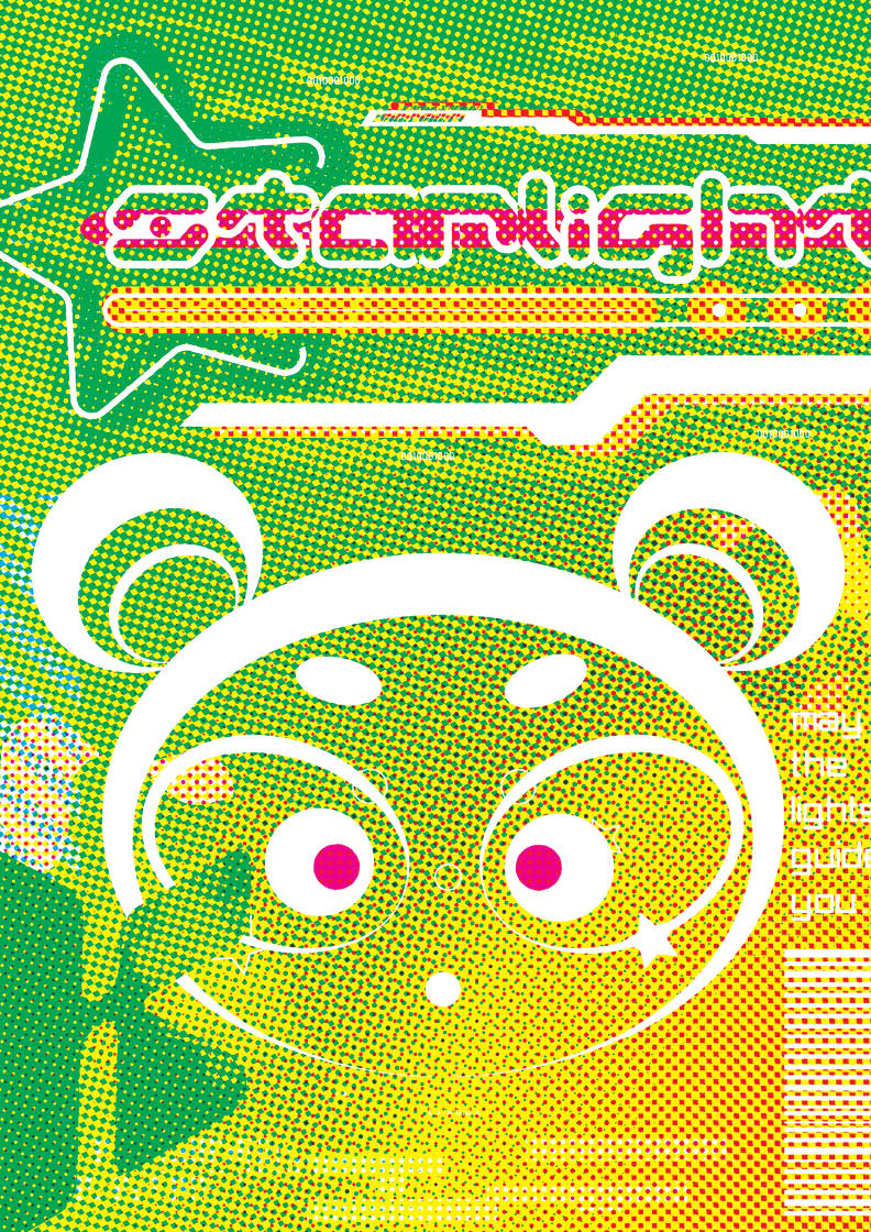
Made in 2023, “starlight” explores CMYK halftones and is inspired by sci-fi and extraterrestrial aesthetics. In terms of the cartoonish figure, the iconicAstro Boy was the main inspiration, with curved edges and pops of color being the main aspects of this design.
03: “Style Spread”
2021
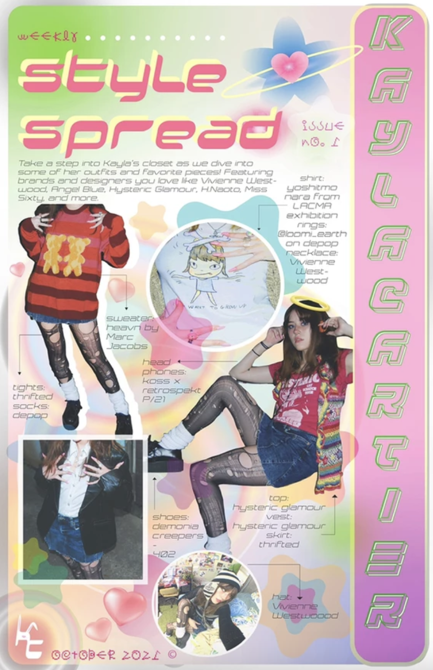
This “style spread”, made in 2021, is a prototype for an imagined fashion magazine that I created, featuring pictures of my own favorite fashion pieces and looks. The color palette and font choices are highly inspired by Harajuku fashion magazines, most notably, FRUiTS Magazine.
04: “Storytelling With Futura” Type Specimen Book
2022

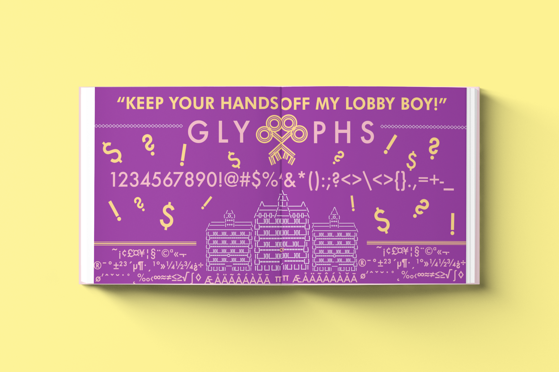
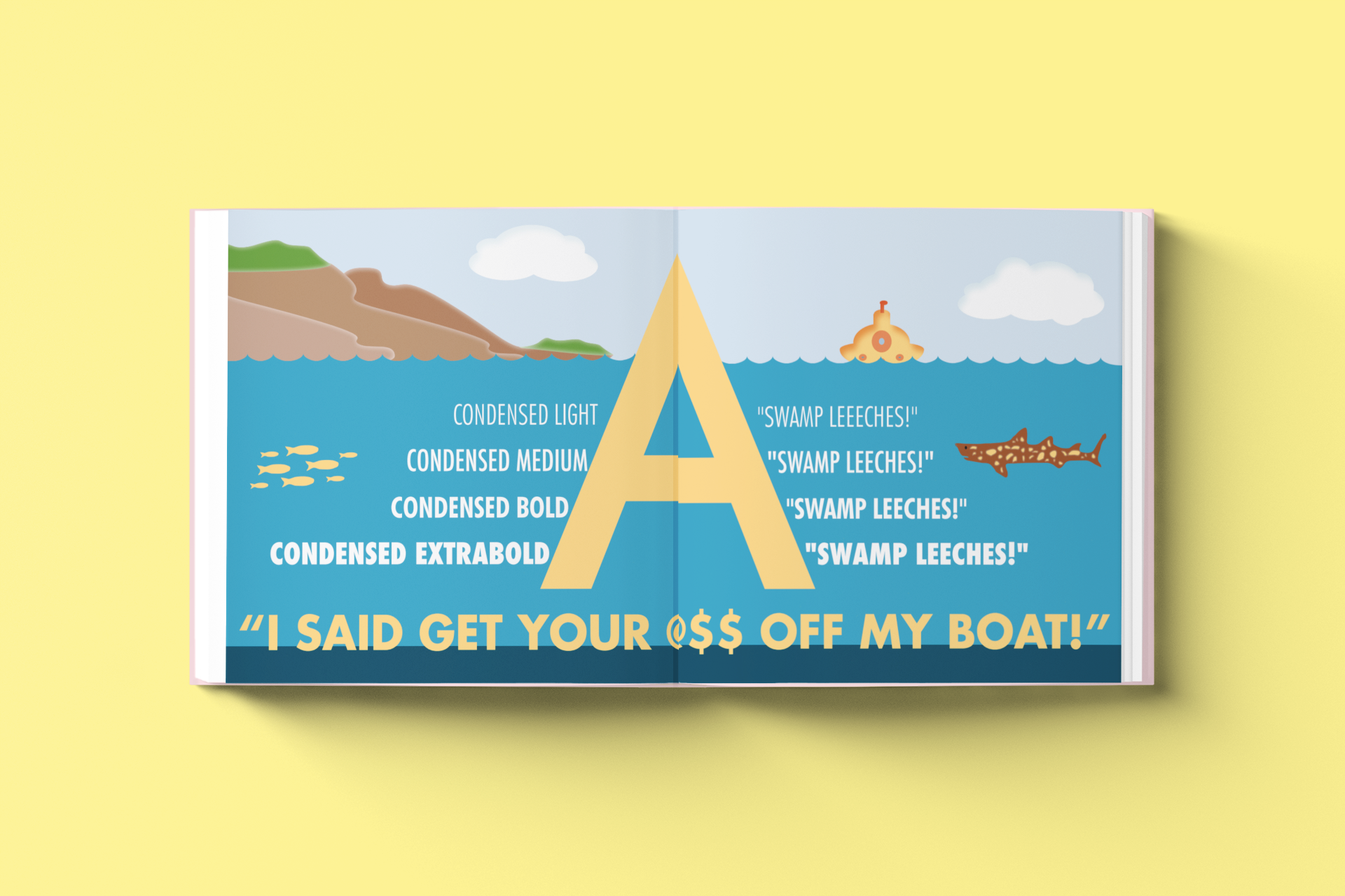
This specimen book dives into the inner workings of Futura as a typeface, as well as its relationship with world-famous director (and my personal favorite) Wes Anderson’s films and their aesthetic relationship. It flows and changes form from a range of visuals inspired by a handful of Anderson’s most iconic films: Fantastic Mr. Fox, Bottle Rocket, Rushmore, The Grand Budapest Hotel, The Darjeeling Limited, The Life Aquatic, and The Royal Tenenbaums.
05: “Pinkahol Can Design”
2023
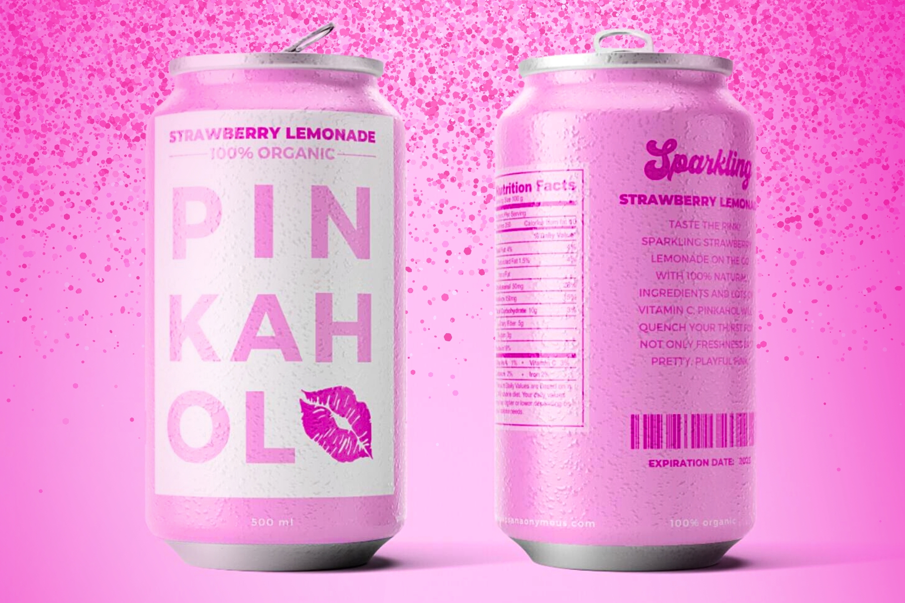
My design that was chosen as the final choice for Pinkaholics Anonymous' "Pinkahol" strawberry lemonade can, embodies a blend of modernity and elegance, while respecting Pinkaholics Anonymous' signature affinity for the color pink. The design is intentionally made to be simple yet vibrant. A key feature of this design is the use of stacked typography in the "Pinkahol", strategically arranged to be visually stimiluating. This typographic approach both maintains readability and efficiently utilizes the available space on the can.
06: “LOCO Festival Mockup Poster”
2022

The LOCO festival at Binghamton University is a celebration of multiculturality, multiethnicity, and diverse thinking. I helped brainstorm and design concepts for the branding and promotion of LOCO Festival 2022 at Binghamton University. This poster is one of the visions I had for the event, incorporating bright colors, flowing movement, yet a sense of unity within each element to reflect the ideals and goals of the event.
07: “Twitch Banner”
2022
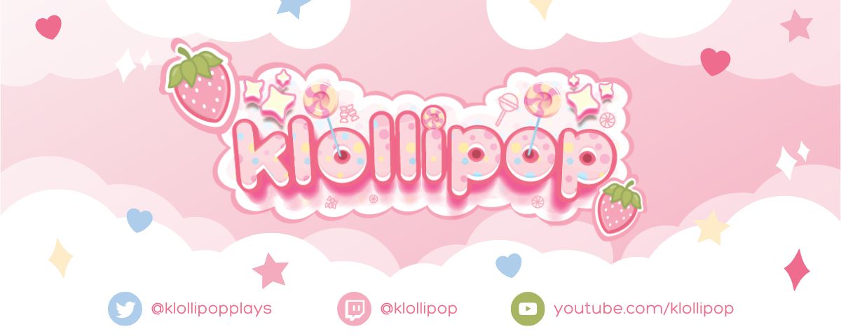
This is a Twitch streaming banner I made for personal use in 2022. The name, logo, and design were imagined and executed by me. This project displays an aesthetic that caters towards a younger, vibrant audience that engages with online media and entertainment, video games, and more.
08: “House (1977)” Movie Poster
2021
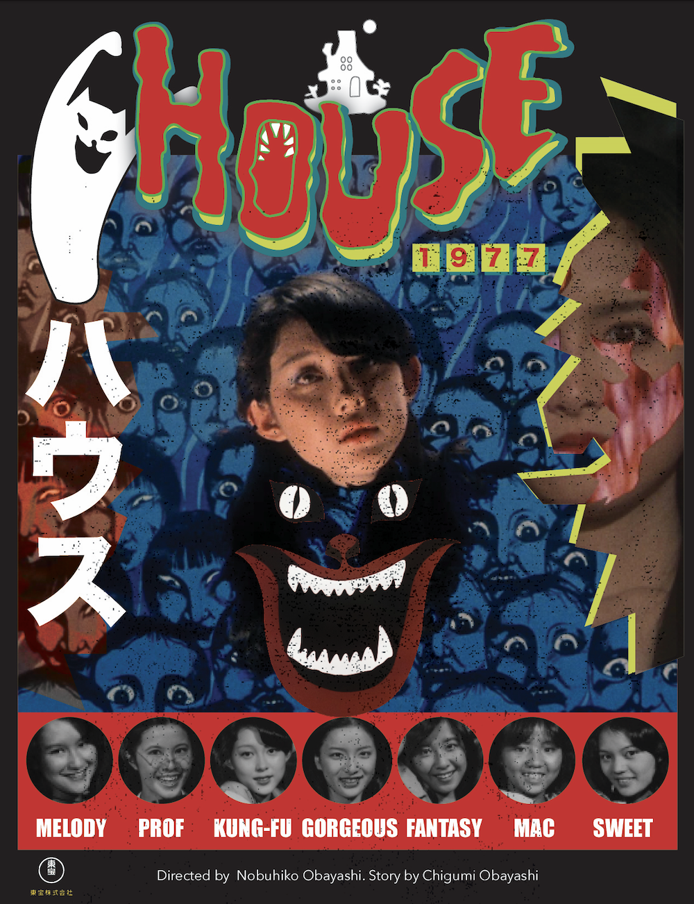
“House” (1977) is a film I will never forget watching for the very first time. The Japanese horror film made in 1977 (the date is commonly clarified so as to not be confused with the other film of the same name) directed by Nobuhiko Obayashi, inspired me with its strange yet almost comedic scenes, likable characters, and captivating visuals. The only word I could use to describe this film is “camp”, an aesthetic style and sensibility that regards something as appealing because of its bad taste and ironic value. This style is something I carried in mind with me in this poster design, as I wanted to convey the film’s strangeness but also appreciate and honor its genuine artistic value.
©Kayla Cartier